Branding / Visual Identity
Philosophy
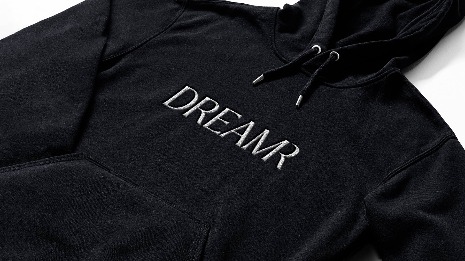
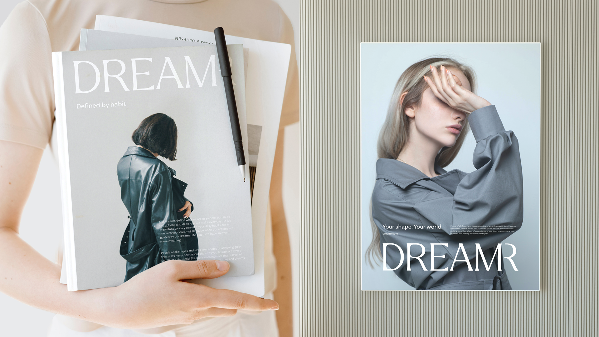
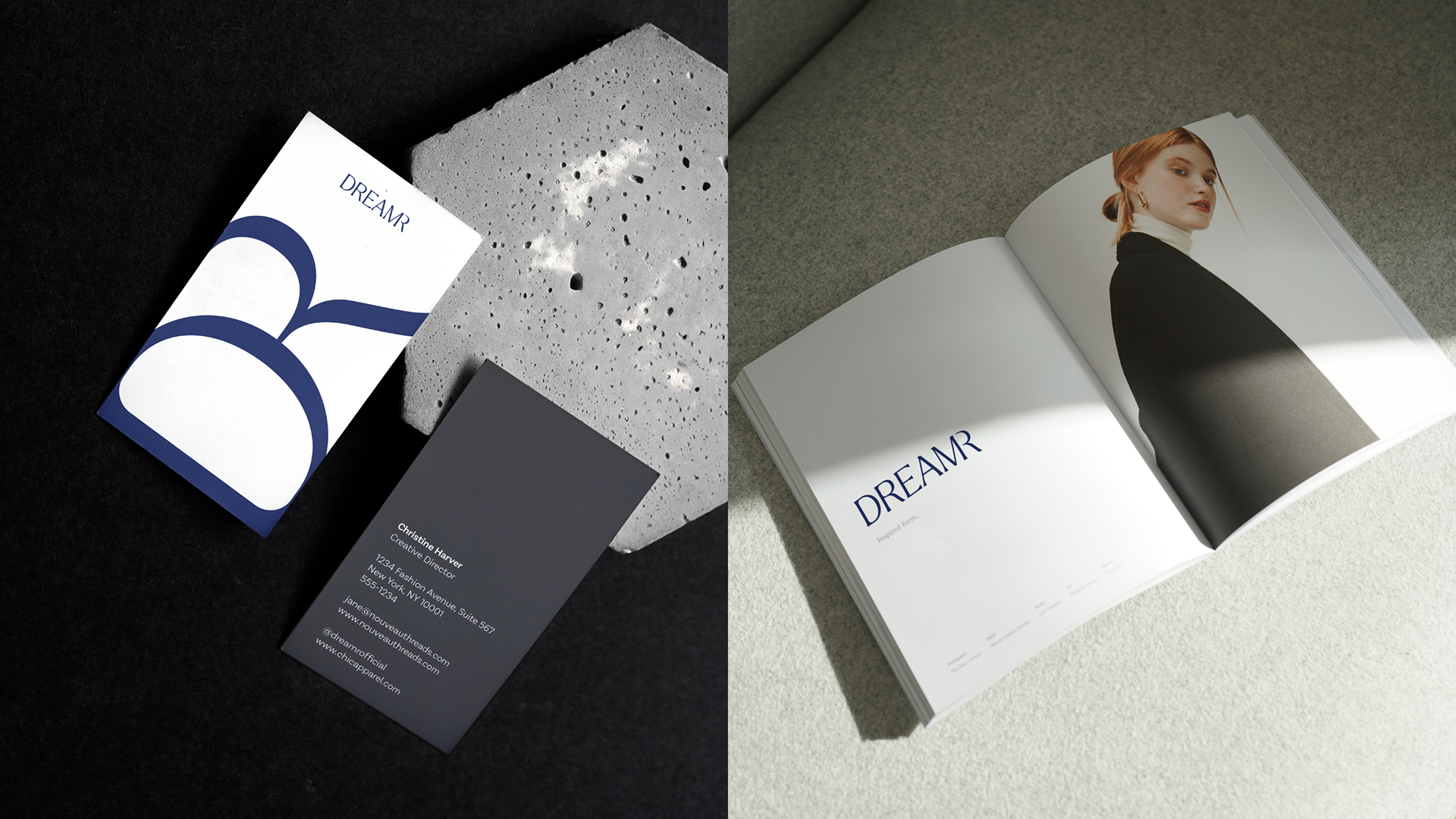
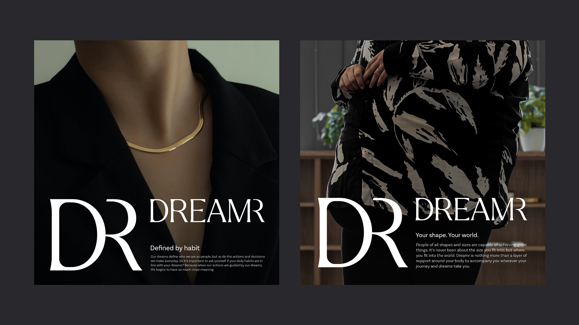
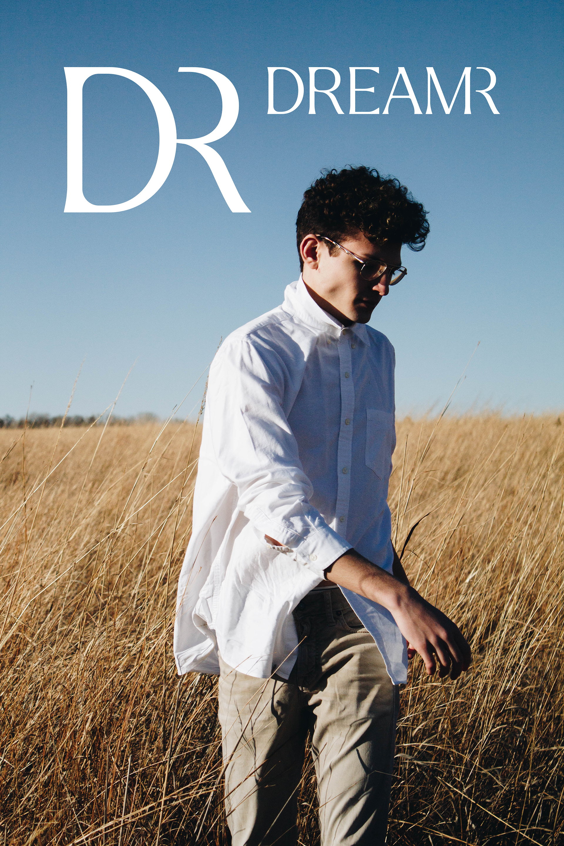
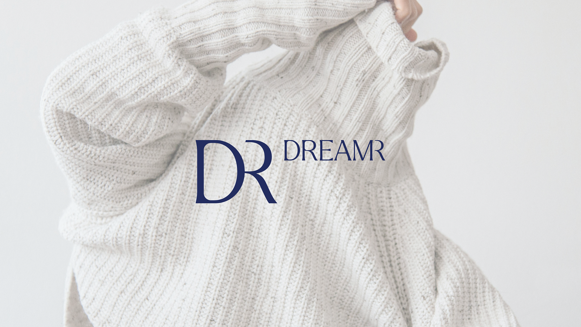
The design is independent and calming, much like most of our dreams. Blending the letters as needed illustrates not only how closely connected we are as people to our dreams but how close we are to achieving them.
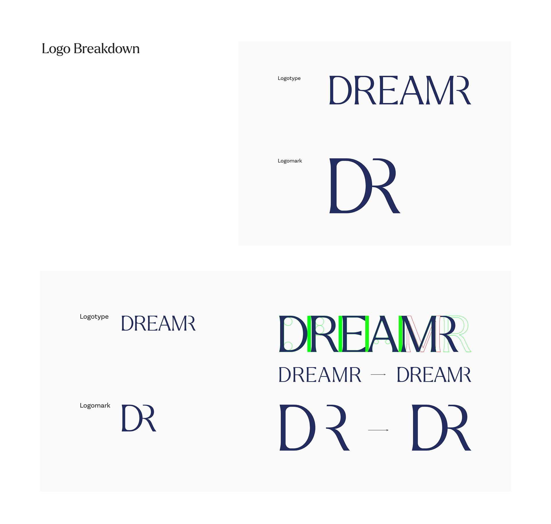
Logotype
Larken is the basis of our font, but by smoothing out the inside of the lines and keeping the outside firm, we created a gentle yet independent personality for Dreamr. Merging the last “R” of the logo illustrates how intimately connected we, the “Dreamr,” and our “Dream” are to reality.
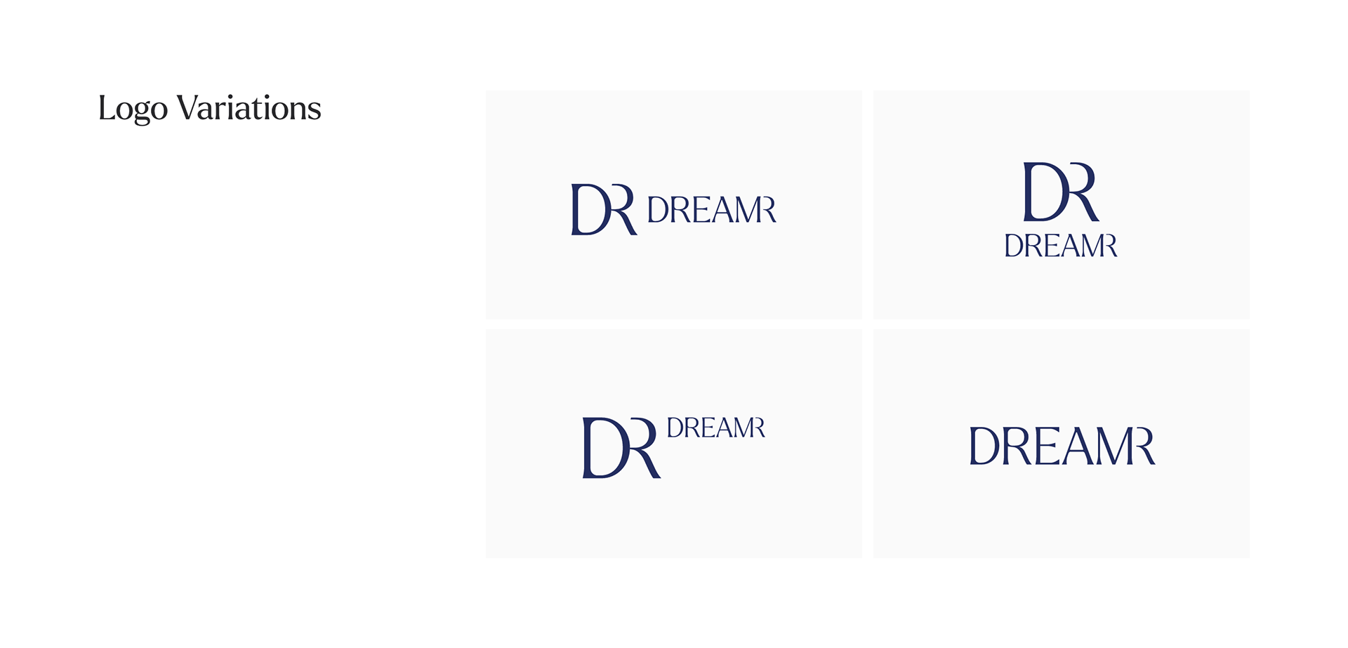
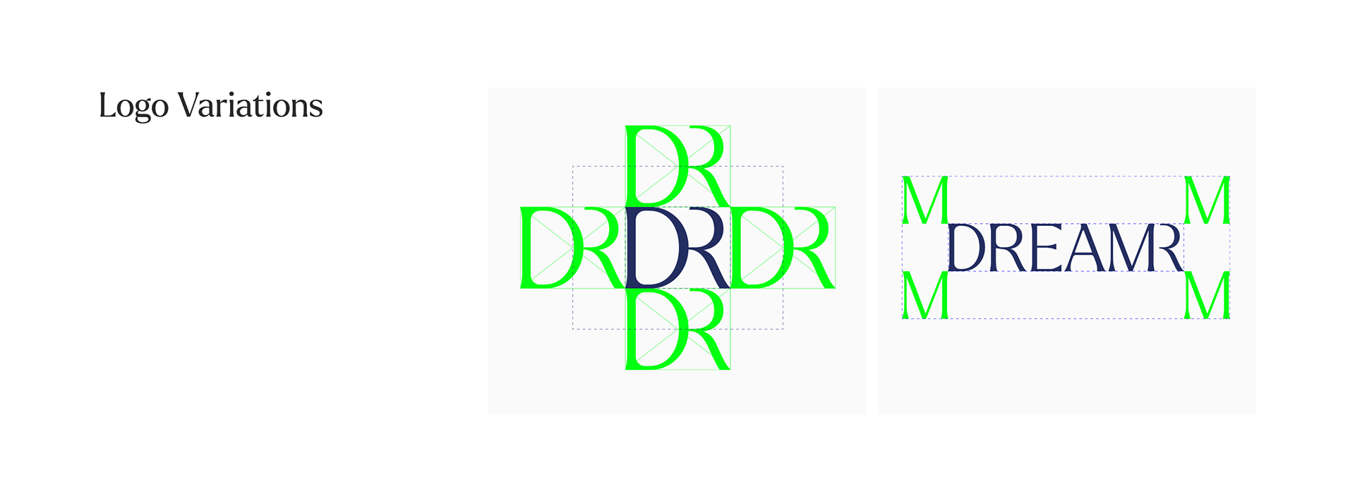
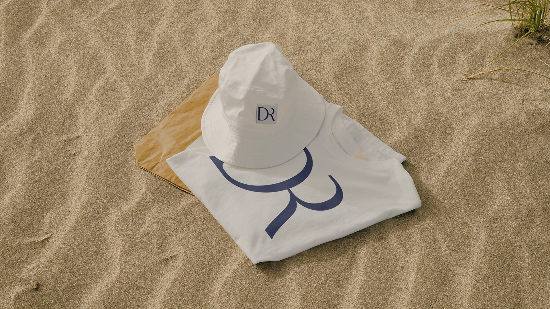
logo mark
“D” & “R” are used to give the brand a short abbreviation. Additionally, the same processing method for the logotype to produce the brand’s representative symbol.